
")
Cryptocurrency markets are known for their volatility, making price prediction an essential skill for traders and investors. To navigate these turbulent waters, a variety of technical indicators are used to analyze market trends and forecast future price movements. Here’s a list of the top 10 indicators that can help predict crypto prices in 2024
Here is the list of Top 10 Indicators
- Moving Averages (MA)
- Moving Average Convergence Divergence (MACD)
- Relative Strength Index (RSI)
- Stochastic Oscillator
- Bollinger Bands
- On-Balance Volume (OBV)
- Fibonacci Retracement
- Ichimoku Cloud
- Volume
- Accumulation/Distribution Line (ADL)
Moving Averages (MA)
Moving Averages (MA) are a technical trading and investment analysis indicator. They help smooth out price data over a specified period to give a clearer view of the trend direction. The MA is calculated by taking the average price of an asset over a set number of past periods.
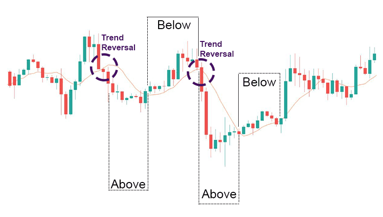
There are different types of Moving Averages, with the most common being the Simple Moving Average (SMA) and the Exponential Moving Average (EMA). The SMA calculates the average price using a simple arithmetic mean, while the EMA gives more weight to recent prices, making it more responsive to new information.
In essence, MAs are used to:
- Identify trends: A rising MA suggests an uptrend, while a falling MA indicates a downtrend.
- Determine momentum: MAs can signal whether the momentum is increasing or decreasing.
- Find support and resistance levels: Prices often bounce off the MA lines, which can act as support in an uptrend or resistance in a downtrend.
It’s important to note that MAs are lagging indicators, meaning they are based on past prices and tend to follow market movements rather than predict them. Traders often use multiple MAs with different time frames to get a more comprehensive view of the market
Moving Average Convergence Divergence (MACD)
The Moving Average Convergence Divergence (MACD) is a trend-following momentum indicator that shows the relationship between two exponential moving averages (EMAs) of a security’s price. It was developed by Gerald Appel in the 1970s and is designed to reveal changes in the strength, direction, momentum, and duration of a trend in a stock’s price.
Here’s a breakdown of how MACD works:
- MACD Line: This is the main line and is calculated by subtracting the 26-period EMA from the 12-period EMA.
- Signal Line: This is a 9-period EMA of the MACD line. It acts as a trigger for buy or sell signals.
- Histogram: This is a visual representation of the difference between the MACD line and the Signal line.
The formula for MACD is:
MACD=12-Period EMA−26-Period EMA
Traders use MACD by looking for signals such as:
- Crossovers: When the MACD line crosses above the signal line, it’s a bullish signal, suggesting it might be a good time to buy. Conversely, when the MACD line crosses below the signal line, it’s a bearish signal, which might be a good time to sell.
- Divergence: If the MACD is moving away from the price trend, it could indicate that the current trend is weakening.
- Rapid Rises/Falls: If the MACD rises or falls rapidly (the histogram gets longer), it suggests that the asset is overbought or oversold and might soon return to normal levels.
MACD is best used with daily periods, and the traditional settings of 26/12/9 days are the default for many charting platforms. It’s a versatile indicator that can be used on its own or in conjunction with other indicators to provide a more robust analysis.
Relative Strength Index (RSI)
The Relative Strength Index (RSI) is a momentum oscillator used in technical analysis to measure the speed and magnitude of price movements. The RSI helps traders identify overbought or oversold conditions in the market for security. Here’s a more detailed explanation:
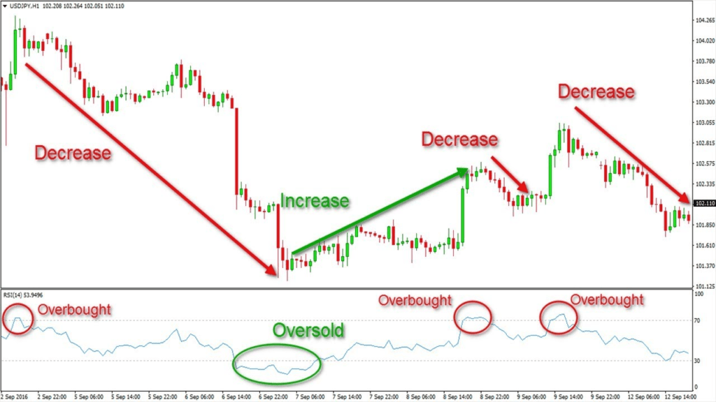
- What It Measures: RSI evaluates the recent price changes to determine the strength of a security’s price movement. It’s displayed on a scale from 0 to 100 and can indicate whether security might be primed for a trend reversal or a corrective pullback in price.
- How It Works: The RSI compares the magnitude of a security’s recent gains to its recent losses, aiming to assess the speed and change of price movements. This comparison is then plotted as a line graph, which oscillates between two extremes, indicating overbought or oversold conditions.
- Overbought and Oversold Levels: Traditionally, an RSI reading above 70 suggests that a security is overbought and may be due to a price decline. Conversely, an RSI below 30 indicates an oversold condition, potentially leading to a price increase.
- Calculation: The RSI is calculated using this formula: RSI=100−[1+Average LossAverage Gain100] The average gain or loss is typically calculated over 14 days, although other time frames can be used.
- Usage: Traders often use the RSI in conjunction with other technical indicators to make informed trading decisions. It’s particularly useful in range-bound markets, where the price oscillates within a consistently high and low range.
The RSI is a valuable tool for traders looking to gauge market sentiment and potential price movements. However, it’s important to use it as part of a comprehensive trading strategy, considering other factors and indicators for the best results.
Stochastic Oscillator
The Stochastic Oscillator is a momentum indicator used in technical analysis that compares a particular closing price of a security to its price range over a certain period of time. It’s designed to generate overbought and oversold trading signals within a 0–100 bounded range of values.
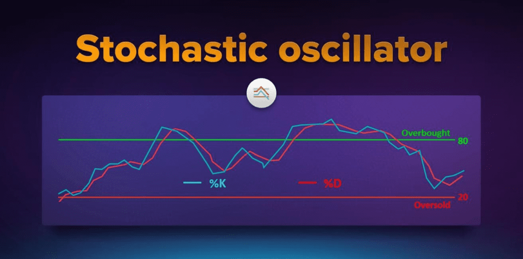
Here’s how it works:
- %K Line (Fast Stochastic): This is the main line of the oscillator, calculated by comparing the most recent closing price to the high-low range over a specific period, typically 14 days.
- %D Line (Slow Stochastic): This is a moving average of the %K line, which helps to identify trends.
- Overbought and Oversold Conditions: Readings above 80 indicate that the asset might be overbought, while readings below 20 suggest it might be oversold.
The formula for the Stochastic Oscillator is:
%K=(C-L4/H14-L14)×100
where:
- ( C ) is the most recent closing price,
- ( L14 ) is the lowest price traded of the 14 previous trading sessions,
- ( H14 ) is the highest price traded during the same 14-day period.
Traders look for signals such as:
- Crossovers: When the %K line crosses above the %D line, it’s a bullish signal. Conversely, a crossover below the %D line is bearish.
- Divergence: If the price is making new highs or lows that aren’t matched by the Stochastic Oscillator, it could signal a price reversal.
It’s important to note that while the Stochastic Oscillator can be a powerful tool, it should not be used in isolation. It’s most effective when combined with other forms of analysis to confirm trading signals.
Bollinger Bands
Bollinger Bands are a technical analysis tool developed by John Bollinger in the 1980s. They consist of three lines:
- Middle Band: This is a simple moving average (SMA) of the security’s price, typically over the last 20 days.
- Upper Band: Set two standard deviations above the middle band.
- Lower Band: Set two standard deviations below the middle band.
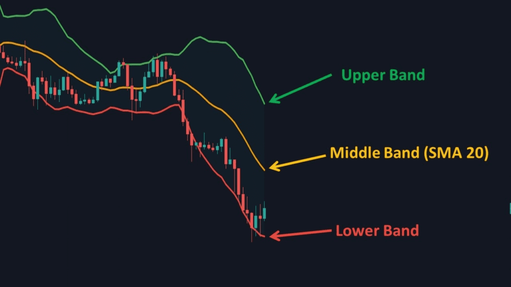
The bands expand and contract based on market volatility:
- Expansion: Indicates increasing volatility and a widening of the bands.
- Contraction: Suggests decreasing volatility and a narrowing of the bands.
Bollinger Bands are used to:
- Identify Overbought/Oversold Conditions: When the price touches the upper band, it may be overbought, and when it touches the lower band, it may be oversold.
- Spot Market Trends: If the bands are trending upwards or downwards, it can indicate a strong market trend.
- Determine Breakouts: Prices moving outside of the bands can signal a continuation of the trend or a potential reversal.
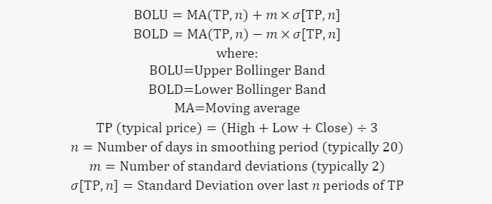
The calculation involves the following formula:
Traders often use Bollinger Bands in combination with other indicators to make more informed trading decisions.
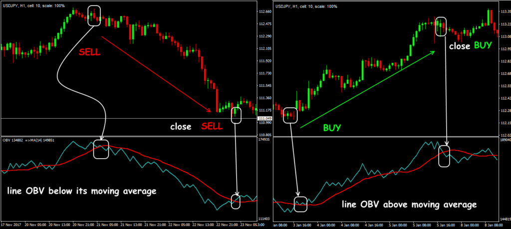
On-Balance Volume (OBV)
On-balance volume (OBV) is a technical indicator used in market analysis that combines volume and price to predict price movements. It’s based on the principle that volume precedes price movement, making it a useful tool for traders to gauge buying and selling pressure.
Here’s how OBV works:
- Calculation: OBV adds the volume on a day when the price closes higher than the previous day’s close and subtracts the volume on a day when the price closes lower.
- Cumulative Total: The result is a cumulative total of volume that reflects whether volume is flowing into or out of a given security or currency pair.
- Trend Confirmation: A rising OBV suggests that buyers are willing to step in and push prices higher, while a falling OBV indicates that sellers are in control and prices may fall.
The formula for OBV is:
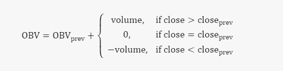
Where:
- ( \text{OBV} ) is the current on-balance volume level.
- ( \text{OBV}_{\text{prev}} ) is the previous on-balance volume level.
- ( \text{volume} ) is the latest trading volume amount.
Traders use OBV to:
- Identify Breakouts: If the OBV is rising during a trading range, it may indicate accumulation and a potential upward breakout. Conversely, a falling OBV may signal distribution and a possible downward breakout.
- Spot Divergences: If the price is making new highs but OBV isn’t, or if the price is making new lows but OBV isn’t, it could indicate a weakening trend and a possible price reversal.
OBV is a momentum indicator that can provide insights into the strength of price movements and help traders make more informed decisions
Fibonacci Retracement
Fibonacci Retracement is a technical analysis tool that uses horizontal lines to indicate potential support and resistance levels on financial charts. These levels are derived from the Fibonacci sequence, a series of numbers where each number is the sum of the two preceding ones, starting from 0 and 1.
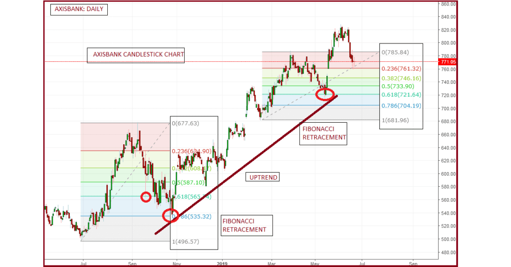
Here’s how Fibonacci Retracement works:
- Levels: The common Fibonacci Retracement levels are 23.6%, 38.2%, 61.8%, and 78.6%. Although not a Fibonacci ratio, 50% is also used.
- Application: Traders draw these levels between two significant price points, such as a high and a low, and the resulting lines represent areas where the price could stall or reverse.
- Use: It helps traders identify strategic places for transactions to take place, potential reversals, and areas to set stop-loss orders or take profits.
The concept is based on the idea that markets will retrace a predictable portion of a move, after which they will continue to move in the original direction. The Fibonacci levels are particularly useful in trending markets and are used in conjunction with other indicators for more reliable signals.
Remember, while Fibonacci Retracement can be a valuable tool, it should not be relied upon exclusively. It’s most effective when used as part of a broader technical analysis strategy
Ichimoku Cloud
The Ichimoku Cloud, also known as Ichimoku Kinko Hyo, is a comprehensive technical analysis tool that provides insights into market dynamics. It’s designed to offer a “one look” view of the market, showing support and resistance levels, momentum, and trend direction.
Here’s a breakdown of the Ichimoku Cloud components:
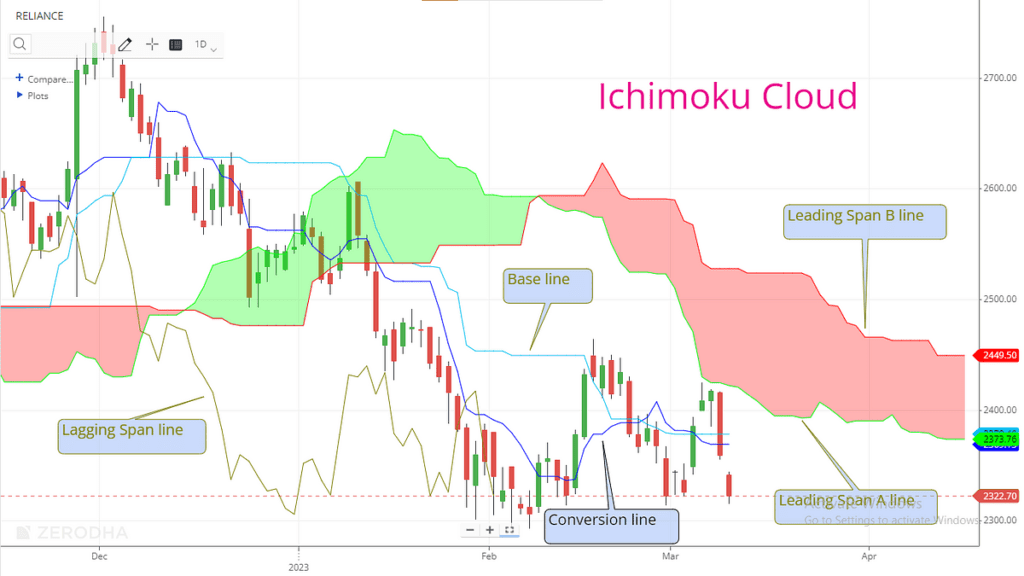
- Conversion Line (Tenkan-sen): Represents the midpoint of the highest and lowest prices over the last 9 periods.
- Base Line (Kijun-sen): The midpoint of the highest and lowest prices over the last 26 periods.
- Leading Span A (Senkou Span A): The average of the Conversion Line and Base Line, plotted 26 periods ahead.
- Leading Span B (Senkou Span B): This represents the midpoint of the highest and lowest prices over the last 52 periods, plotted 26 periods ahead.
- Lagging Span (Chikou Span): The current closing price is plotted 26 periods behind.
The “cloud” is formed by shading the area between Leading Span A and Leading Span B. It helps traders identify potential areas where the price may find future support or resistance. When the price is above the cloud, the trend is considered bullish, and when it’s below the cloud, the trend is bearish. The cloud’s direction can also give insight into the strength of the trend.
The Ichimoku Cloud is valued for its ability to provide a quick understanding of the market situation, making it a popular choice among traders for its depth of information and ease of use once understood
Volume
The Volume indicator in technical analysis is a tool that measures the number of shares (in the stock market) or contracts (in futures or options) that have been traded over a specific period. It’s a key metric used by traders to assess the strength of a price move and the liquidity of an asset.
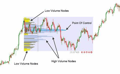
Here’s what the Volume indicator signifies:
- Market Strength: Rising markets on increasing volume are typically viewed as strong and healthy. Conversely, when prices fall on increasing volume, the trend is gathering strength to the downside.
- Trend Confirmation: A rising market should see rising volume, indicating increasing buyer enthusiasm. If the price is rising but volume is decreasing, it might suggest a lack of interest and a potential reversal.
- Exhaustion Moves: Sharp price moves combined with a sharp increase in volume can signal the end of a trend, as it may indicate that participants are piling in at market tops or bottoms.
Volume indicators can also be part of more complex technical tools like On-Balance-Volume (OBV) and the Klinger Oscillator, which use volume data to predict future price movements1. Traders often combine volume analysis with other indicators to make more informed trading decisions.
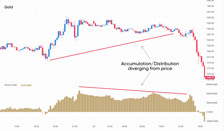
Accumulation/Distribution Line (ADL)
The Accumulation/Distribution Line (ADL) is a technical analysis indicator that combines price and volume to show how much of a security is being accumulated (bought) or distributed (sold). It’s a cumulative line that helps to identify the flow of money into or out of a security, which can provide insights into market strength and potential price movements.
Here’s a simplified explanation of how it works:
- Money Flow Multiplier (MFM): This is calculated based on the relationship between the closing price and the high-low range for the period.
- Money Flow Volume (MFV): This is the MFM multiplied by the period’s volume.
- ADL Calculation: The ADL is the running total of the MFV. If the close is higher than the previous close, the volume is added to the ADL; if the close is lower, the volume is subtracted.
The formula for the ADL is:
ADL=Previous ADL+Current Money Flow Volume
Where:
- ( \text{Current Money Flow Volume} = \text{MFM} \times \text{Volume} )
- ( \text{MFM} = \frac{(\text{Close} – \text{Low}) – (\text{High} – \text{Close})}{\text{High} – \text{Low}} )
Traders use the ADL to:
- Confirm Trends: A rising ADL suggests accumulation and confirms an uptrend, while a falling ADL indicates distribution and confirms a downtrend.
- Spot Divergences: If the ADL is not moving in the same direction as the price, it could signal a potential reversal.
It’s important to note that while the ADL can be a valuable tool, it should be used in conjunction with other forms of analysis for the best results
Read more
10 Interesting Facts About Floki Inu Coin
4 Token Set to Boom by Over 500% in 2024
Conclusion
The indicators we’ve discussed are powerful tools in technical analysis, each providing unique insights into market behaviour and potential price movements. Here’s a summary of their purposes:
- Moving Averages (MA): Identify trend directions and momentum.
- Moving Average Convergence Divergence (MACD): Signal potential buy or sell opportunities through crossovers and divergence.
- Relative Strength Index (RSI): Indicate overbought or oversold conditions, suggesting potential price reversals.
- Stochastic Oscillator: Offer signals for potential price reversals by comparing the closing price to its range over a certain period.
- Bollinger Bands: Measure market volatility and potential overbought/oversold conditions.
- On-Balance Volume (OBV): Predict price movements by analyzing volume flow.
- Fibonacci Retracement: Identify potential support and resistance levels based on key Fibonacci numbers.
- Ichimoku Cloud: Provide a comprehensive view of support/resistance levels, trend direction, and momentum.
- Volume Indicator: Assess the strength of a price move and the liquidity of an asset.
- Accumulation/Distribution Line (ADL): Show the flow of money into or out of a security, indicating market strength.
While each indicator has its strengths, they should not be used in isolation. A combination of indicators, along with other forms of analysis, can provide a more accurate and holistic view of the market. It’s also crucial for traders to remember that no indicator is foolproof. Market conditions, news events, and other external factors can influence price movements, so risk management and due diligence are essential components of any trading strategy.
Thank you for visiting Dollar Street! We appreciate your time and hope you found valuable insights during your stay. Feel free to explore more, and remember: every dollar tells a story. 🌎💰
